
I hate soccer; the low moan of broadcasted sport, the baffling prominence it takes in “news” bulletins, the general boorishness. But as soon as I walked into Metro: Art at Velocity, an east London exhibition of work by Lance Wyman and Eduardo Paolozzi, my stance softened. There before me stood soccer depicted as a pattern of lysergic geometrics, and it really did make the so-called beautiful game look very beautiful indeed. Such is the power of Lance Wyman’s work.
Thankfully, this power has been harnessed for far greater good than changing one curmudgeonly woman’s view on kicking balls: It has helped people recognize and navigate cities, zoos, malls, Olympic events, and cultural centers; It has reinvigorated or invented brands; It has demonstrated the joy that the simplest of icons can bring to a location (take a look through the 1975 Washington, D.C., National Zoo project if you don’t believe me).


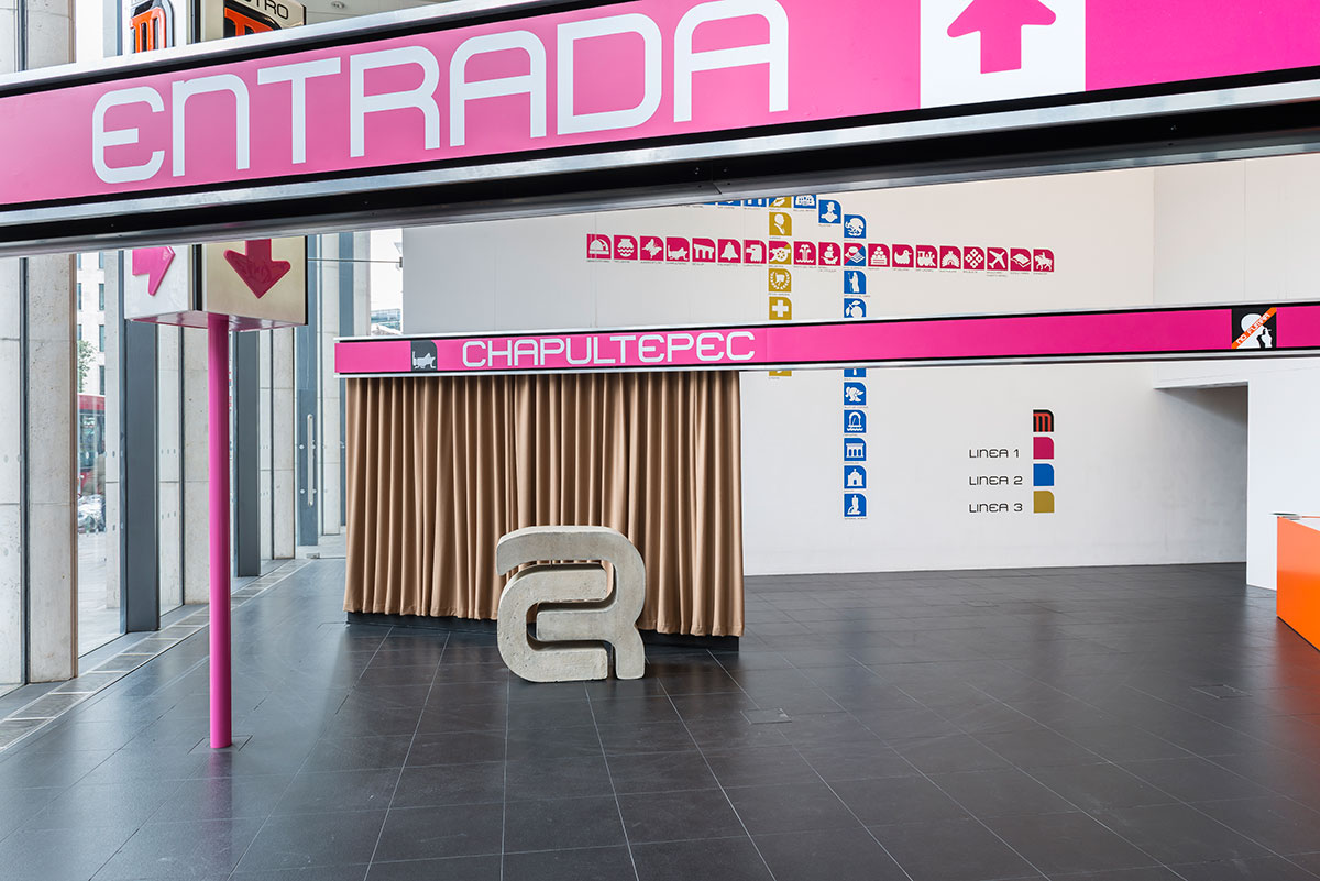
For this exhibition, it is Wyman’s work for Mexico City’s Metro that’s being celebrated, alongside artist Eduardo Paolozzi’s much-loved (and recently, heartbreakingly shelved) mosaics for London’s Tottenham Court Road underground station. It’s an interesting pairing; Paolozzi is firmly grounded in the fine art world, most renowned for his convergence of pop art tropes and classical sculpture techniques, while Wyman is a commercial graphic designer. Yet their bold, color-packed designs for public space strive for broadly the same goals—although Wyman’s must achieve legibility and functionality while Paolozzi’s have more decorative aims, both ultimately look to bring a little joy to the pain of metro travel.
Wyman tells us it’s “an honor to be exhibited with Paolozzi. Our transit work is similar in that we both added recognizable identity to the London and Mexico City systems. He created a landmark station identity and I created a city-wide visual station indexing system.”
The exhibition design aims to echo the way signage and street furniture appear in real life: we see the cute Mexico City Metro worker icons line up on the walls, as they once did in real metro stations, and it adds a brilliantly bold dimension to see 3-D renderings of Wyman’s work around the space. The 3-D works are so sculptural they feel very much like fine art in a gallery context. It engenders interesting questions around the divisions between artist and designer.
“The main difference as I see it, is that as a designer I saw my work as needing to identify each station with an icon that had relevance and could be described in any language,” says Wyman. “As an artist Eduardo created a work of art. I think the difference is that design is mandated to solve problems, artists are mandated to create art for art’s sake.”


What unites the two practitioners is the way their work helps in both obvious and subtle ways to shape the way visitors and locals view a city—how they engage with it, navigate it, and the indentation it leaves on their psyche when they have left that place. Wyman sums up the role of graphics in the metropolis brilliantly: “I think graphics are a visual ambassador. They can be a welcome, a guide and an expression of a city’s own pride. I think ‘design’ is making headway as terms like ‘wayfinding’ have been better understood by city movers and shakers, and designers.
“A city has a multi-layered personality and it usually has a multi-cultured reality. Each city is different and you want your design to function and be accepted once it’s out on the street; you want it to become a positive everyday experience for visitors, workers and residents.”

It’s a treat to see the sketches for Paolozzi’s Tottenham Court Road station mosaic, and the maquette models where his ideas were planned out in miniature 3-D. Wyman’s sketchbooks are also on show, and provide some fascinating insights into the process of a mammoth design project that saw him also create arguably the best Olympics logo of all time for Mexico 1968. Given the chance to speak to him, I have to ask about those little zoo icons. Thankfully, Wyman says they’re some of his own favorite works too.
“I realized there was a specific personality that had to be captured for each animal and it took a few visits and studies with some of them at the Zoo to accomplish that,” he says. “I have been fortunate to have a lot of projects under my belt. Each has its own challenges and rewards and I would need a book to describe my favorites and the bummers. The important thing has been they have all been rich people experiences.”


Such designs, now more than four decades old, prefigure today’s reliance on icon design as a primary communication tool. Whether emojis, on-screen icons, or the humble typed smiley face, today more than ever we speak through tiny distilled images. It’s a development Wyman delights in. 🙂 “I’m happy to see icons becoming such an important part of how we communicate,” he says. “Designing icons is similar to writing; they either communicate well on the different levels intended or they can be visual gibberish. We are still learning how to design good icons.”

