When describing graphic design we often talk of “silence” when there’s plenty of white space, or we say that something has a “loud” aesthetic. We like to hear colors; we enjoy still graphics that seem to vibrate and pulsate with noise. For the Amsterdam-based graphic designer Lyanne Tonk, who currently balances working part-time at the “young and a bit rebellious” Netherlands publisher Das Mag with freelance projects, a sound or lack thereof not only charges a composition but can spark the process behind making one. For certain (relevant) projects, she begins with what she hears. The rest comes afterwards.
Let’s start with the sound of nothing at all, which is where Tonk’s interest in the visual aesthetics of noise first originated. During the final year of her BA in graphic design at Utrecht’s School of the Arts, HKW, in 2013, Tonk explored the effect and function of silence in society—and design—for her final project. She was fascinated by that ubiquitous escapist trend for artisan, “back-to-basics” Kinfolkian living, and its roots in a desire for quietude: “The need for silence seems to be important to us,” says the designer. “Where does the need originate, though? How exactly does it influence us? You can gain a lot from understanding these questions.”
As Massimo and Lela Vignelli once wrote, great graphic designers “have used white space as the significant silence to better hear their message loud and clear.” Tonk unpicks this in a loud, 21st century context, saying that to be able to communicate well, white space—or visual “silence”—of course helps encourage a moment to “reflect and focus.”

“For my research I looked at the inauguration speech of Barack Obama, because he’s such a good public speaker. It appeared that around 30% of it was silence in the shape of a break or a pause between words or sentences.” Her research transformed into a clock installation composed of white noise-inspired graphics and an accompanying booklet. Yet breathing room continues to be an important underlying concept in her work, which she regularly meditates on: “It could be the white space in a book, which gives someone a break and allows them to reflect before reading further. Or on a poster, which you should be able to read quickly, visual pauses create focus.”
While The Sound of Silence is a peaceful, slow-burning project, Tonk’s identity for an annual Netherland music festival called Le Mini Who?, which she’s designed for three subsequent years, goes to the opposite extreme. It’s loud, brash, ecstatic, confusing, and deliciously overwhelming. 2016’s iteration was formed by visually impersonating the “sound, hosts, locations, and performers” of the festival, so you’ve got fingers flying, fleshy ribs bared, swirling chunks of meaty substances, spiky foliage, bulbous gunk. It must be quite the show.
“The bands that play are not hyped yet, and entrance is free. So it’s one big musical discovery,” says Tonk. “The illustrator I collaborated with didn’t know the festival as well as I do, so we used that to our advantage. She listened to the music and created visual ‘sounds’ simultaneously, echoing how the audience would first experience the music. I then used these ‘sounds’ to ‘compose’ a design: the typography became the notes on a score, while the abstract images were the accents.”
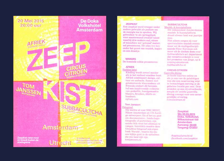
Tonk’s synaesthesia is simply one tool in her box of devices; she’s also the co-founder of a creative co-working space called Kapitaal, where an interest in experimental printing techniques fuels much of her creative output. She identifies as a storyteller first and foremost, and finds sound metaphors just one useful technique to get a viewer into that all-important “contemplative state of mind.”


