
Every Friday we raise a glass to celebrate some of the best new boozy bottles to hit store shelves. This week, we bring you ’90s-tinged psychedelia, Art Deco Amaretto, and wine designs inspired by Le Corbusier.


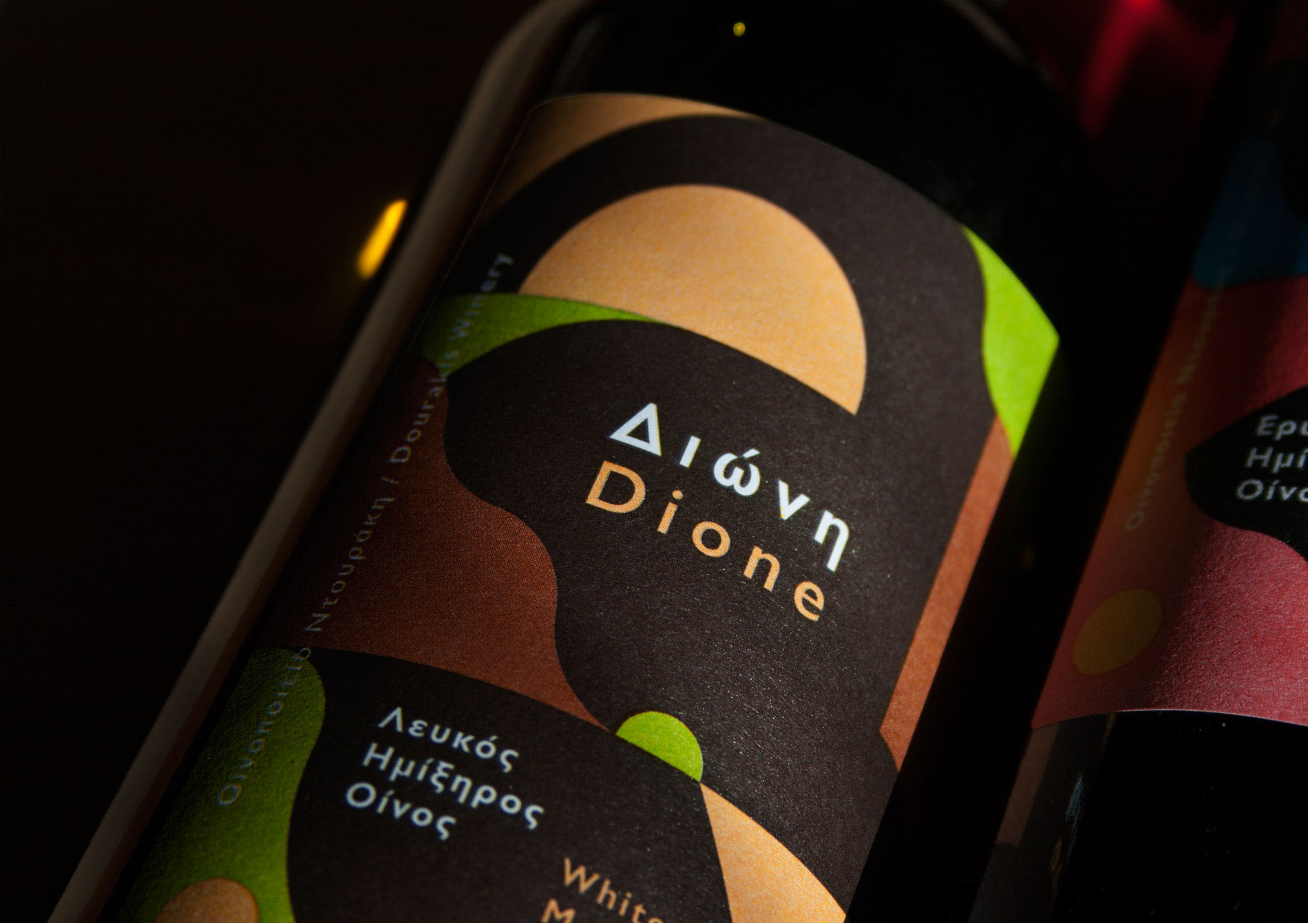


Dione, by The Birthdays Design
Based in Athens, Greece, The Birthdays Design is a creative studio helmed by K. Yiannakopoulou and G. Strouzas. We’re mighty impressed with its recent project for for Dourakis Winery’s latest release Dione, a collection of four wines aimed at “young people” (though hopefully not children).
The studio says it aimed to convey the characteristics of each wine in a “metaphorical but visually strong way,” approaching the labels as if they were a “canvas that visualizes the landscape of the vineyard, as an abstract and colorful composition. The result is a variety of shapes that work in rhythm while the choice of colors represent also the specific type of wine.”


Deviant & Dandy, by Adam Pobiak
“Greetings and three cheers from Deviant & Dandy towers!” bellowed an email at me, chirpily. I imagined said email having the voice of a half-cut Brian Blessed, but instead I discovered it was speaking on behalf of mustachioed east London entrepreneur named Byron, the man behind a sadly short-lived Hawaiian restaurant in Dalston called Pond, and a superb little cocktail joint known as Off Broadway. He’s now teamed up with two blokes called Rupert and Ben to start a brewery named, you guessed it, Deviant & Dandy, and they’ve brought in designer Adam Pobiak to create the packaging.
The labels that have been unveiled so far for the Trust Pale Ale and Strangebrew Lawnmower Ale have that aesthetic last seen in the 1990s where futuristic met 1960s psychedelia, and trousers were baggy as hell. Tune in, drop out, and crack open a can.


Sons of Vancouver Distillery, by Palms
Vancouver-based agency Palms looked to the ornate stylings of the Art Deco movement for its packaging designs for a variety of spirits from Sons of Vancouver Distillery. According to the agency, it went for this look as it felt “the aesthetic connects to SOV’s upbringing and their motivation for starting a distillery.” Each variant in the range has a slightly different approach: “The market for a refined Amaretto is quite different from a brash and blazing Chili Vodka,” says Palms. “Our strategy was to tailor each package design to the audience, while creating elements that unify all three products.
Original illustrations created in-house pair with custom wordmarks to suit each product and further emphasize a handmade feel. This makes for designs that easily extend to things like apparel, posters and matchbooks.” They must have done something right, as I’m salivating as I gaze upon those amber Amaretto bottles, and it’s only 11:23 a.m. Unless I’m just a terrible, sweet-toothed lush.


Jeanneret Wines, by Studio Band
Finally, to Australia, and this rather lovely work for Jeanneret Wines by Studio Band, which also looked to Europe for inspiration. The packaging references the Swiss Design movement “by incorporating a very streamlined and organized approach to the layout within its label,” says the agency. It created designs that developed the brand’s former logo—a nautilus shell representing the Golden Ratio—which led them to thinking about architect Le Corbusier’s designs based on proportions found in the natural world; “a practice that echoes the winemaking process and inspired our approach.
“We evolved the nautilus shell into a stylized ‘J’, and incorporated undulating vines. The label designs were built on proportions seen in Le Corbusier’s work, and the palette was based on his system of harmonious colors.”

