
In recent years, perceptions around the plastic bag have shifted. It’s gone from an unremarkable piece of detritus, simply something to carry groceries in, to something demonized. Plastic bags—and their partners in crime, plastic straws—are easily relinquished quotidian objects that we’re finally, collectively shelving, now that we’ve seen their turtle-strangling, whale belly-filling potential.
This is, of course, a good thing. For one man, Sho Shibuya, plastic bags have an altogether different significance as well: Many of them, as he’s pointed out, are really rather beautiful brandishers of cute graphics, chipper slogans, and great typography. In a project that’s part aesthetic celebration, part love letter, and part environmentally motivated farewell, he’s created a book showcasing his favorites.


Shibuya is the founder of New York design agency PLACEHOLDER, and began collecting bags when he moved to the city from Tokyo around seven years ago. He was motivated not only by the graphics adorning the utilitarian, everyday shopping bags, but also by the Japanese concepts of “eight million gods” or “yaoyorozu no kami,” which recognizes and respects gods within even the most banal-seeming inanimate objects. “We cherish each thing, even a plastic bag,” he says. “To me, it’s not garbage, it’s something attractive that has character to it.”


Over the years, Shibuya has amassed more than 100 bags, which he stores, folded Kondo-style, in a plan chest. A few of his faves are proudly displayed on the walls in custom-made frames. After witnessing the environmental implications of plastics bags come to the fore of collective consciousness, he thought it was high time to wave goodbye to them in style, by photographing them and documenting them in his 144-page book Plastic Paper. “It’s no secret that single-use plastic bags are choking our cities and our planet,” says Shibuya. “This book is not an exercise to advocate for wasteful plastics. It’s quite the opposite: It’s an act of preservation of everyday design, and a call to give greater care to the objects we use every day, to reuse them and waste less, and to find happiness and inspiration in the little acts of art and creativity we’d otherwise miss.”

The tome boasts a bright yellow cover in homage to the hue of New York’s metro cards and cabs. The whole project sings of his adopted home. “When I moved to New York, I realized that all the bags for the delis and bodegas have no branding,” he says. “They’re so different from the ones in Japan, where each shop has its own unique design. These designs don’t belong to anyone, they belong to and give form to the image of the city as a whole. They have graduated from the specific to the general vernacular.”
Shibuya’s fascination even led him to a plastic bag factory in Bushwick, Brooklyn, where he found that each of the bags they make has “its own twist” on things—smileys with different facial expressions, and so on.

When he decided that it was time he archive this collection, he began working with photographers Vanessa Granda and Henry Hargreaves to capture his collection in the best possible light, with copywriter Cole Kennedy working on the text. He also invited a copywriter on to the project to help convey a narrative. He asked artists such as Anna Roberts to paint pictures of the bags, PANGAIA to create seaweed fiber T-shirts, and UX designers TwoMuch from London to create a digital counterpart to the book. “Already, it’s become more than a book,” says Shibuya “It’s a collaboration with creators; it’s something meaningful.”
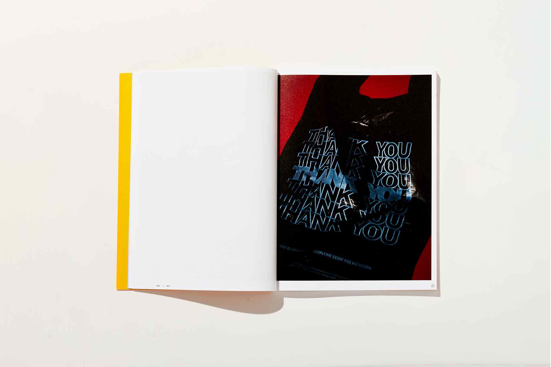
“The smiley face, the quintuple Thank You, the purple flowers are as much a piece of the visual landscape of the city as Milton Glaser’s “I heart NY” or Massimo Vignelli’s subway map.”


Looking at the images in the book, it’s clear that the vernacular of plastic bags is entrenched in graphic design more widely. Shibuya points to the work of Verdy, who’s used the “Thank you for shopping here” typography across various designs. “The smiley face, the quintuple Thank You, the purple flowers are as much a piece of the visual landscape of the city as Milton Glaser’s “I heart NY” or Massimo Vignelli’s subway map,” says Shibuya.


In putting together the book, Shibuya realized how choosing the materials for the publication impacts the story he’s telling. “We need to think bigger picture, even if it’s a corporate project, and think about the deeper meaning of what we can express,” he says. “Nowadays, if you’re buying some T-shirt or a new product, it’s really important to hear the story and pick sustainable materials, even if it’s a little bit pricey.” The cover uses a UV spot; while body copy was set in “very neutral” Helvetica Neue, referencing the typeface on the footer of the bags, as well as letting the visual content play the starring role.


“This project was born out of an appreciate and respect for everyday design and its contribution to the aesthetic culture of NYC,” says Shibuya. “Let this book remind you that despite their role in defining the visual design of our city, the era of the single-use plastic bag is well overdue. We’re eager to see this prolific veteran of our daily design experience retire, and make room for a new surface for expression.”


