


What’s the key to branding a place that’s a huge expanse of experiences that are stressful, tiring, exciting, and occasionally confusing? That’s the task New York agency Base Design was faced with when it won the job of rebranding JFK’s Terminal 4.
As one of the world’s busiest air terminals, the space needed a look and feel that wasn’t only seamlessly functional, but also fun. As Base Design’s partner and creative director Min Lew puts it, travelling is a “stressful experience. Up until recently, airports were designed around airplanes and efficiency, not the people going through them. There are a lot of great recent examples that use architecture to generate empathetic programming but we wanted to take it a step further.”


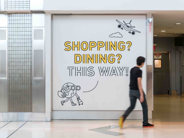
The new designs feature a custom typeface and hero the “4” character, with a bright and cheerful suite of colors. Illustrator Tomi Um was commissioned to create large-scale interior illustrations throughout the space. The prominence of the “4” gently underscores a brand principle Base was keen to push—that the airport is “4 all” people and travelling needs.
Base chose to hone in on the idea of reconfiguring the human experience of an airport as a starting point, aiming to bring the personality of the space to the fore, while still referencing its architecture. Its goal was to “change a traveler’s experience from apprehension and confusion to reliable ease and efficiency, with thoughtful and unexpected human touches along the way.”
These touches include typographic wall graphics showing New York trivia and quotes, as well as Um’s artwork across pillars, which double up as a gentle nudge for customers towards food and drink offers. The new identity is being rolled across all touchpoints over the next year, including out of home advertising and digital platforms.


