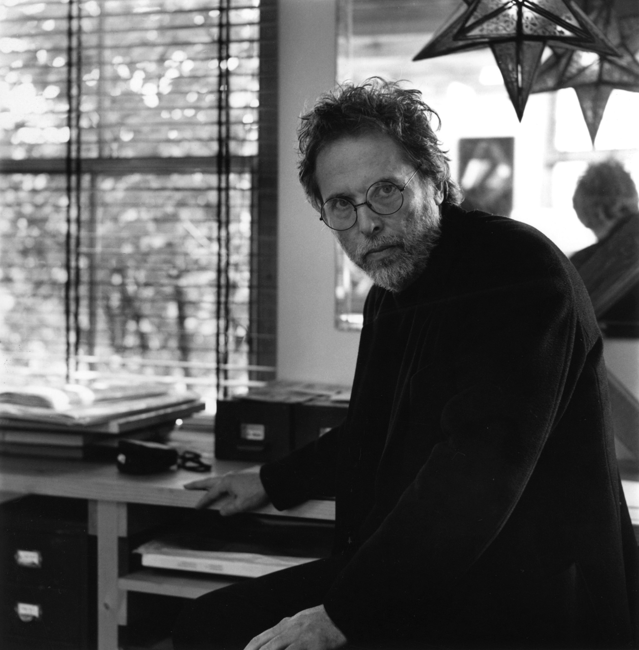
David King had one of the most remarkable graphic design careers of the 20th century. If his name is unfamiliar, it’s not for lack of success, but rather that his accomplishments were incredibly varied and took him away from the mainstream design industry—first towards political activism, then finally to visual histories. As writer and critic Rick Poynor puts it, in his last few decades King “wasn’t interested in his earlier reputation as an award-winning designer, he had a mission and it consumed him.” That mission was to collect visual material from the Russian Revolution and Soviet-era, along with more general left-wing historical artifacts from around the world, and he pursued it with a total commitment and at a not insubstantial personal cost and risk.
By the time of King’s death in 2016, Tate had acquired his entire collection—easily one of the largest in the world—which encompassed an estimated 250,000 items, including photographs, posters, publications, and ephemera. Amassing such a significant archive of visual material would be an impressive life’s achievement on its own, but King managed to do this alongside an award-winning and politically era-defining career as a graphic designer. The title of Poynor’s new book on the designer, David King: Designer, Activist, Visual Historian, published by Yale University Press, provides a succinct breakdown of the three phases that King’s working life can be divided into. He was best known early on for his editorial designs at the influential Sunday Times Magazine and covers for Penguin books, and his political posters defined the graphic aesthetic of the British left in the ’70s and ’80s. Besides his influential collection, King used his skills as a designer to further causes he vehemently believed in, especially the fight against racism, fascism, and human rights violations.


Born in Isleworth in 1943, King “despised capitalism” even as a child, as he wrote in one of the many books he authored. He went on to study graphic design at the London School of Printing and Graphic Arts, where his teachers included Richard Hollis and Robin Fior, two of London’s most politically involved designers, as well as Rolf Brandt, brother of the famous German photographer Bill Brandt. It was with Fior, a member of the anti-nuclear Committee of 100, that King first worked using the paste-up method (cutting and sticking by hand) on layouts for the pacifist newspaper Peace News in 1962. Throughout his career he maintained a very tactile approach to design, never switching to the computer. Editorial design and political activism would be the two key defining aspects of the rest of his career. It was also Fior who introduced King to the work of German designer and political satirist John Heartfield, whose montage style would be a key visual influence for King.
After finishing his studies, King went to work as art assistant at Queen magazine, one of swinging London’s most fashionable publications, under the direction of the influential Tom Wolsey. King’s time at Queen was short-lived, he left with Wolsey to form the advertising agency Stratton & Wolsey, but while working at the magazine he made two important connections. One was with the photographer Don McCullin and the other with illustrator Roger Law, with whom in 1965 King designed the first issue of Magnet News, a newspaper aimed at a Black British audience. Many features of King’s later work—as well as his interest in racial equality—can be seen in this particular freelance project, such as imposing bold typography and heavy dividing lines. It caught the eye of Michael Rand, art director of The Sunday Times Magazine, who offered King a job as a designer in 1965. Two years later, he was promoted to become art editor. The magazine was the first color supplement to be published by a British newspaper and had a well-earned reputation for the quality of its writing and imagery, with features free from the disruptive presence of advertising, which was kept separate.
King worked for The Sunday Times Magazine for ten years in all, five of which were in a freelance capacity that gave him more freedom. His graphic influences there included Pop Art—King often used brightly colored and multi-layered silkscreen prints for his illustrations, as well as half-tone color effects—Constructivism, and avant-garde photomontage. However, it was his ability to lay out photographs creating a compelling visual narrative, as well as his eye for cropping, that ultimately lead to his success at the magazine, a serial D&AD Award winner during Rand’s tenure.
Notable examples of King’s visual approach included his work with Don McCullin’s unflinching Vietnam war photographs and a cover article on boxer Muhammad Ali, illustrated with photographs King himself had taken during Ali’s training for his fight against George Foreman. King had started taking photography seriously while at the magazine; later, his portraits of writers would often appear on the covers of the London Review of Books. The Ali article was expanded into a magazine-like book, I Am King: A Photographic Biography of Muhammad Ali.


King’s role at The Sunday Times Magazine, as Poynor stresses, was more than just design, he was a “visual journalist” and “he was conceiving and authoring the stories from a visual perspective.” Some of the stories King designed at the magazine foreshadowed his later passions, such as a 1969 cover story on Mao, a profile of Heartfield in 1968, and a 1967 article on the 50th anniversary of the Russian Revolution. Designers at the magazine were free to pitch ideas for articles themselves, something King occasionally took advantage of, and which helped shape his role as a hybrid author, picture editor, and designer. Poynor is keen for his book to highlight King as a prime example of “the designer as author,” having been absent from the influential essays on the subject during the 1990s.
In 1970, King’s first year as a freelancer, he undertook a research trip that would have a life-changing impact; a three-week trip to Moscow, his first time visiting the USSR. He was there finding images for a two-part article on Lenin, but his personal attempts to find images of Leon Trotsky became more important as he discovered just how suppressed his political hero’s legacy was in Soviet Russia. This lead to a pictorial Sunday Times Magazine article on Trotsky in 1971, which King expanded into his first book, Trotsky: A Documentary. He designed and provided the images himself, while the text was written by Francis Wyndham, a frequent collaborator. The title hints at King’s filmic approach to books, combining image and text to create a dramatic and compelling visual narrative, and the book sold well. It also cemented in King’s mind that the skills he had developed working on magazines were best utilized on full-length books.

More books would come later, but first King became engaged in an activity for which his distinctive, hard-hitting visual aesthetic would be most famed: his voluntary design of material for various political activist groups, including the Anti-Apartheid Movement, the National Union of Journalists, the Socialist Workers Party the El Salvador Solidarity Campaign, Rock Against Racism, and the Anti-Nazi League. King’s political posters provided what, in his own words, he described as a “visual style for the Left” in the turbulent ’70s and ’80s in Britain, and were ubiquitous at protests. His approach was unnervingly direct, with huge sans-serif typography, unflinching photographs, and text emphasized through his trademark underlines, arrows, and exclamation marks. He also sometimes used his Heartfield-inspired collage style of illustrations. Tight budgets meant that the quality of paper and printing was generally low, and color often limited, but King used this to his advantage and was a master of economical printing. Overlaying two colors to create an intense third color became one of his visual hallmarks.
During his early years at The Sunday Times Magazine in the late ’60s, King had done a little freelance work on the side, most notably the design with Roger Law for the The Who’s third album The Who Sell Out, as well as two Jimi Hendrix sleeves, Axis: Bold as Love and Electric Ladyland. When he left the magazine in 1975, such highly commercial projects were out of the question, but King needed work to help fund his collection and trips to Russia, as well as his unpaid design work for various activist movements. Salvation came through freelance book cover design projects, for clients such as Pluto Press, a left-wing London publisher whose logo was designed by King’s early mentor Robin Fior. The majority of his cover briefs came from his friend and Penguin’s then art director David Pelham, who used King to design books mostly about the left-wing subjects close to his heart. Pelham remembers King as a “deeply thoughtful and concerned humanist with a profound social conscience. A fiercely driven communicator, who devised his own very singular visual grammar—a loose graphic language with which to convey his urgent messages concerning social inequality and injustice.”
Another commercial client was the Museum of Modern Art in Oxford, whose director David Elliott hired King to design memorable posters and catalogues for Soviet-related exhibitions, for which he often also lent material from his collection. By the 1980s, he was starting to devote less time to design work to focus more on his collection. He considered graphic design a young person’s game, but he continued to work until towards the end of the decade, most notably for City Limits, a weekly London listings magazine, and Crafts, the magazine of the British Craft Council. For both magazines, King used some of his customary visual hallmarks, characterized by Poynor as Pop Constructivism—heavy rules, stars, arrows, big typography, and dramatic photography—though the more daring use of color that he had developed in his activist posters was perhaps the most striking feature of his later work.


King’s withdrawal from the graphic design industry coincided with the decline and then finally the breakdown of the USSR. This meant that his picture library was in high demand and began to pay dividends. His collection continued to grow and the specialisms it opened up soon evolved into an impressive output of books. King’s collection, combined with his distinctive design approach, formed a unique kind of graphic authorship where he was in control of what was in the book and how it was presented. These books including Blood & Laughter (1983) on caricatures from the 1905 revolution; The Great Purges (1984) on Stalin’s repressions; Ordinary Citizens (2003), a poignant photographic record of Stalin’s victims; Trotsky: A Photographic Biography (1986); Russian Revolutionary Posters (2015); and The Commissar Vanishes (1997), a ground-breaking exploration of Stalin’s editing and falsification of history in art and photography. The books cemented King’s reputation as an expert in his field. “He cared deeply about his content and he used perfectly judged graphic means to communicate it,” says Poynor. “Controlling both content and form, he was an author in the fullest sense of the word.”
King’s political posters provided what, in his own words, he described as a “visual style for the Left.”
The culmination of King’s collecting was his opus, Red Star Over Russia: A Visual History of the Soviet Union from 1917 to the Death of Stalin, a 345-page book published by Tate in 2009 following the start of his relationship with the art institution in 2002, when they mounted a display at Tate Modern of 100 Russian posters from his collection. King died in 2016, at age 73, in a period between the Tate acquiring his full collection and their mounting it in 2017, in an extensive exhibition version of Red Star Over Russia in honor of the 100th anniversary of the 1917 revolution. Poynor had been due to meet King to discuss the prospect of a monograph on his work around the time he died, but the project still went ahead. He hopes that it will help to “reinstate King,” adding that “he was a designer of remarkable vision and breadth, one of the best Britain has produced.” The book, beautifully designed by Simon Esterson, and a new website devoted to King, are both a fitting tribute to a remarkable individual.