As editorial director at AIGA, I keep tabs on all the design news (so you don’t have to) and bring you only the best bits. Behold: my weekly hit list of the most interesting things I’ve and seen, read, and watched this week. Follow along all day every day on Instagram @AIGAdesign and Twitter @AIGAdesign.
This week I…
…can’t believe that at this time last year we had barely launched our @AIGAdesign Instagram handle and now we’ve turned 100 (thousand)! In case you didn’t catch our celebration this past weekend, check out the custom 100’s these fantastic designers created just for us (awww).
…find a new Twitter obsession with @passabledesign, which is basically the love child of graphic design and The Onion.

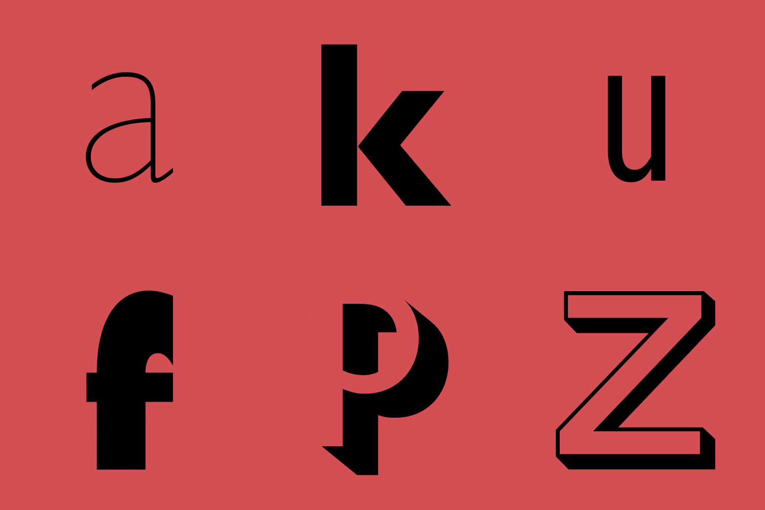
…am just as excited as all the other font fans out there about the new Eric Gill Series Monotype just launched. Gill Sans is (dare I say it) my absolute favorite typeface, and designer George Ryan does it proud with Gill Sans Nova, his remastered version with “25 new fonts, alternative characters, new weights originally commissioned as custom fonts, and decorative styles from specimen books that weren’t previously available digitally. It also features new display fonts including Gill Sans Deco, a design that had previously been withdrawn from Monotype’s library.”
…add “tiny prefab house” to my Muji shopping list. Where else am I gonna store all my perfectly minimal notebooks and pens?
…am legit thrilled to see the Guggenheim embrace an online-only exhibition, as watching museums attempt to incorporate digital tools in their shows has led to some awkward and clumsy results (not naming names). When you log into “Åzone Futures Market” you get a bunch of fake money to invest in one of 36 different future technologies that will then play out before your eyes. Not gonna lie, making my first trade felt a bit like loading up that Myst CD-ROM for the very first time.
…congratulate the young designers that made Sight Unseen’s annual American Design Hot List, “an unapologetically subjective editorial award for the 20 names to know now in American design.” This year the list, which is typically relegated to industrial designers only, includes multidisciplinarian Anna Karlin, whose work ranges from digital and print to interiors and set design, as well as Fort Makers, who occasionally venture over to the graphic side with their pattern work.

…am not shy about my love for UK art and design blog It’s Nice That, but I have to admit I felt a twinge of disappointment when I saw the cover of the latest Printed Pages, a biannual print publication of the their best stories. Apparently the deconstructed face of Kanye “marks the new direction this issue takes [and] we needed something bold and a little subversive.” Sorry, but what’s new or bold or subversive about Kanye at this point?

…go on a colorful road trip to visit the geographical origins of some of the most famously beautiful hues, most of which have some not-so-pretty origins, like orchil (orchid pink), which comes from a medieval Florentine bacteria, or cochineal (what made British redcoats so red), which is derived from ground up insects, or Tyrian purple, a dye made from sea snail secretions for Roman emperors’ robes. Yum.

…would kill to go to OFFSET in London next week. Have you seen the speaker line up?
…load up on candy after reading these five take-aways from the recent Core77 Conference, yet another coulda-woulda-shoulda event.


