
Also in this week’s Design Diary, a lovely new redesign for stellar publisher Sternberg Press, a fantastic looking website and publishing workshop for New Yorkers, and this year’s branding for the Long Night of the Museums in Barcelona. For more along these lines (and so many others) you can follow along all day, every day on Instagram @AIGAeyeondesign, Facebook, and Twitter @AIGAeyeondesign.


Long Night of the Museums, TwoPoints.Net
In 1997, Berlin held the first ever Long Night of the Museums, with 18 of the city’s museums staying open long after the regular visiting hours and welcoming people in for free. Since then, it has inspired similar events in 40 different countries, including Nit dels Museus in Barcelona, Spain. Barcelona residents will have to wait until May 18 to take advantage of the night of free after-hours admission, but until then we can all admire this year’s colorful gradient branding by TwoPoints.Net.
According to the studio, almost all of the previous years’ branding featured a dark background to signify nighttime—“a pretty obvious solution,” the designers quip. TwoPoints.Net decided to do the opposite and create a vibrant identity: “A moon, filled with an abstract interpretation of Barcelona’s dawn, rises and inaugurates a bright night.”

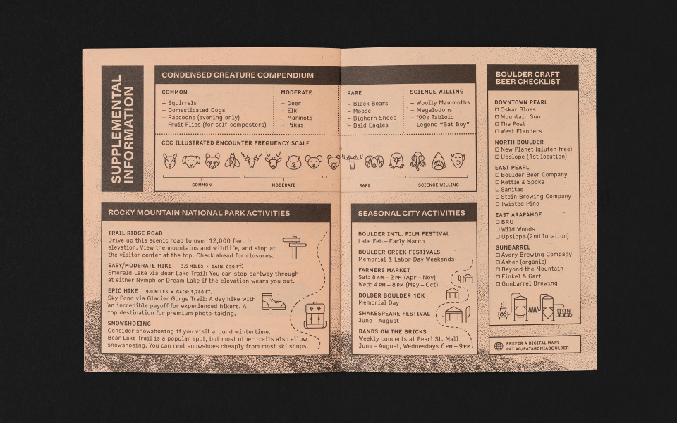


Boulder Guide Book, Cast Iron Design and Patagonia
The folks at Cast Iron Design have sent over a recent project commissioned by Patagonia, in the form of a city guide booklet for Boulder, CO. The pocket-sized guide is itself a nice little object, printed on textured, recyclable Kraft-Tone paper stock from French Paper Company and full of recommendations for the outdoor-lover’s urban haven—everything from nearby trail heads and common animal sightings to the best coffee in Boulder.
But the real highlight of the project is the ink: Cast Iron used Living Ink, made from algae. As the designers put it, “Algae-based ink is significant because it replaces the petroleum-based pigments used in conventional offset ink and has a smaller carbon footprint.” Living Ink hasn’t yet made it to market, so this city guide is a wonderful proof-of-concept, and chance to get your hands on the “World’s First Algae Offset Ink,” as the project claims to be.

Fruitful School at Pioneer Works, John Provencher and Laurel Schwulst
Starting January 5, 2020, graphic designer and developer John Provencher and artist, designer, and educator Laurel Schwulst will hold a six-week workshop on websites and self-publishing at Pioneer Works in Brooklyn, NY. Called Fruitful School, the new workshop asks potential participants to apply with an idea for what they’d like to publish online, which they’ll build themselves during the course. As the workshop leaders put it, “A fruitful web is visually diverse. We like seeing things we’ve never seen before.” It also changes over time; is light, fast, accessible, and energy conscious; and “can be an alternative to corporate social media.” For an example of the fruitful web, one perhaps has to go no further than the website for Fruitful School. While you’re there, consider applying—applications close ay 11:59pm EST on Monday, December 23, 2019.

Chinese Type Archive, Synoptic Office
Last year, we wrote about Ming Romantic, a Chinese font a decade in the making from Casper Lam and YuJune Park of Synoptic Office. The Bodoni-inspired font was a “complete reimagining” of Chinese type, according to the pair, and because of the sheer volume of Chinese characters that exist, Lam and Park are releasing the typeface piecemeal over the course of a few years. From that project has sprung another of impressive scale: Synoptic Office is launching a Chinese Type Archive, which will contain visual references for more than 100 Chinese typefaces. The archive will be in both English and Chinese, and Lam and Park have also named the different fonts, which were previously just titled after their printer. “We hope this archive will serve as a catalyst for research and discussion, a meeting place where people can contribute and get information—a kind of Wikipedia for Chinese type,” the designers say. The archive will launch in beta in January 2020.

Sternberg Press Website, Wkshps and Knoth & Renner
And finally, we’ll leave you with this freshly redesigned website for Sternberg Press, publisher of many, many excellent art and design books. Created by Wkshps and Knoth & Renner, the relaunched website is simple but skillfully interactive, with navigation that cleverly shows off its title list. Special props for the floating and intersecting two dimensional books that greet you when you enter the site.

