


We hope you weren’t expecting a history lesson from the new COLORS book, emphatically sub-titled A Book About A Magazine About the Rest of the World. According to the current editor of COLORS magazine, artist and photographer Patrick Waterhouse, it’s “more of a celebration” than an account of how the uncompromising editor and art director team of Oliviero Toscani and Tibor Kalman launched “a magazine about the rest of the world” for United Colors of Benetton in 1991. It seems only fitting that an unconventional title like this should be documented in an unconventional way. So to tell the story of the magazine “of the MTV generation,” the current COLORS team handed the reins over to Italian publishing house Damiani, to allow for the “fresh point of view” that can only come from an outside perspective.
When Kalman, Toscani, and Karrie Jacobs created the magazine in 1991, Toscani “wanted a magazine without any stars, without any celebrities, and without any news.” He decided they’d interview people nobody knew, and they’d use the internet to find stories. This approach and the formula that Toscani and Kalman created—a combination of dynamic graphics, striking photographic imagery, provocative themes, and an unwaveringly global outlook—has become familiar to magazine readers now, which is part of the reason Damiani felt it was the right time to publish the book. With it, they hope to firmly establish COLORS’ status as the founder not only of today’s independent magazines, but of mainstream media as well.


For his part, Waterhouse made crucial changes to the magazine when he was appointed editor in 2011, opting for more complexity and less obvious shock-factor in order to reflect “the state of the world today, a world of more diversity and globalization than ever before.” The current COLORS team also has its own important undertaking: they haven’t published a single issue since June 2014. Waterhouse assures me they’ve got something in the works, but it’s clear they have enough on their plates without the added onus of reflecting on the 90 issues that came before. Instead, we have Damiani’s version, which reads like an explosive parade of COLORS confetti, a collection brought together by those who loved and savored each issue. Every period of the magazine is relished and respected with equal weight, from early Kalman issues all the way up to Waterhouse’s most recent ones.
Despite ideological changes and shifts in tone over the magazine’s 25-year history, there’s a “COLORS DNA,” as Waterson puts it, that binds all generations of the magazine together. One common thread? “Visual artists and designers have often been editors,” says Waterhouse. “That inversion, where imagery is just as important as text, has been a central point” of what makes COLORS different. Today, this practice is practically de rigueur. Current titles like Print Isn’t Dead, The Gourmand, and Rubbish Famzine are just a few examples of mags produced by design studios—but someone had to set the precedent.
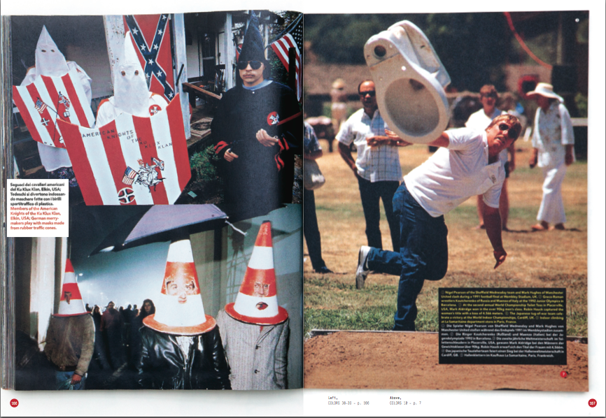
When you turn the pages of COLORS you’re struck by one powerful and surprising image after another: a cow’s head oozing red blood as it lies on a chopping board, nude bodies posed against stark white backgrounds, a KKK doll laid nonchalantly across the page. It’s not just that these images are provocative, but the way they expand and swell across the entirety of the spread proves an effective method of storytelling.

The new book is homage through montage. “We approached it as if we were making a special issue, creating something new using only existing material,” say publishers Sebastiano Mastroeni, Alessandro Cavallini, and Andrea Cavallini. Waterhouse calls the project “a cut-and-paste version of the magazine.” Anyone looking for hard facts or a timeline should console themselves on Wikipedia. There is some sense of order, though. Chapters like “Elvis,” “I want to believe,” and “Where the hell is my tail” are cheeky attempts to group the images into themes. The publishers say that laying out the book was like trying to “organize a big family dinner” with loud uncles, aunts, nephews, and grandparents that all wanted to have their say.
The only thing Damiani wasn’t able to print was the image they consider the “most iconic and recognizable in the universe of COLORS:” the picture of the British Queen with black skin. “The government of New Zealand didn’t allow us to publish it,” Mastroeni, Cavallini, and Cavallini sigh.
The last chapter of COLORS is its most emphatic, and perhaps contextualizes why Damiani felt so strongly that this book had to be produced today. It ends with Kalman’s 13th and practically wordless issue, composed of 356 pages of photographs followed by a single section of text: “In an era of increasingly visual communication, those people who never learn to read images—to analyse, question, even revisit them—are at a disadvantage.”
Kalman even went as far to call for lessons in school in which kids would spend an hour every morning looking at a single picture. “That’s the future,” he reflected. Like COLORS itself, this notion was both timely and uncannily ahead of its time.

